
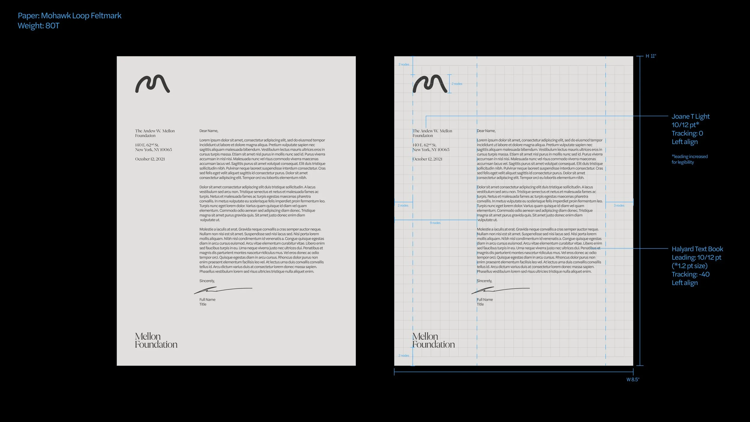
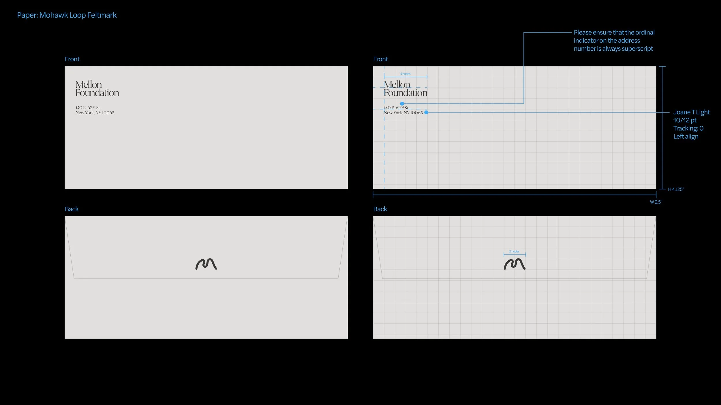
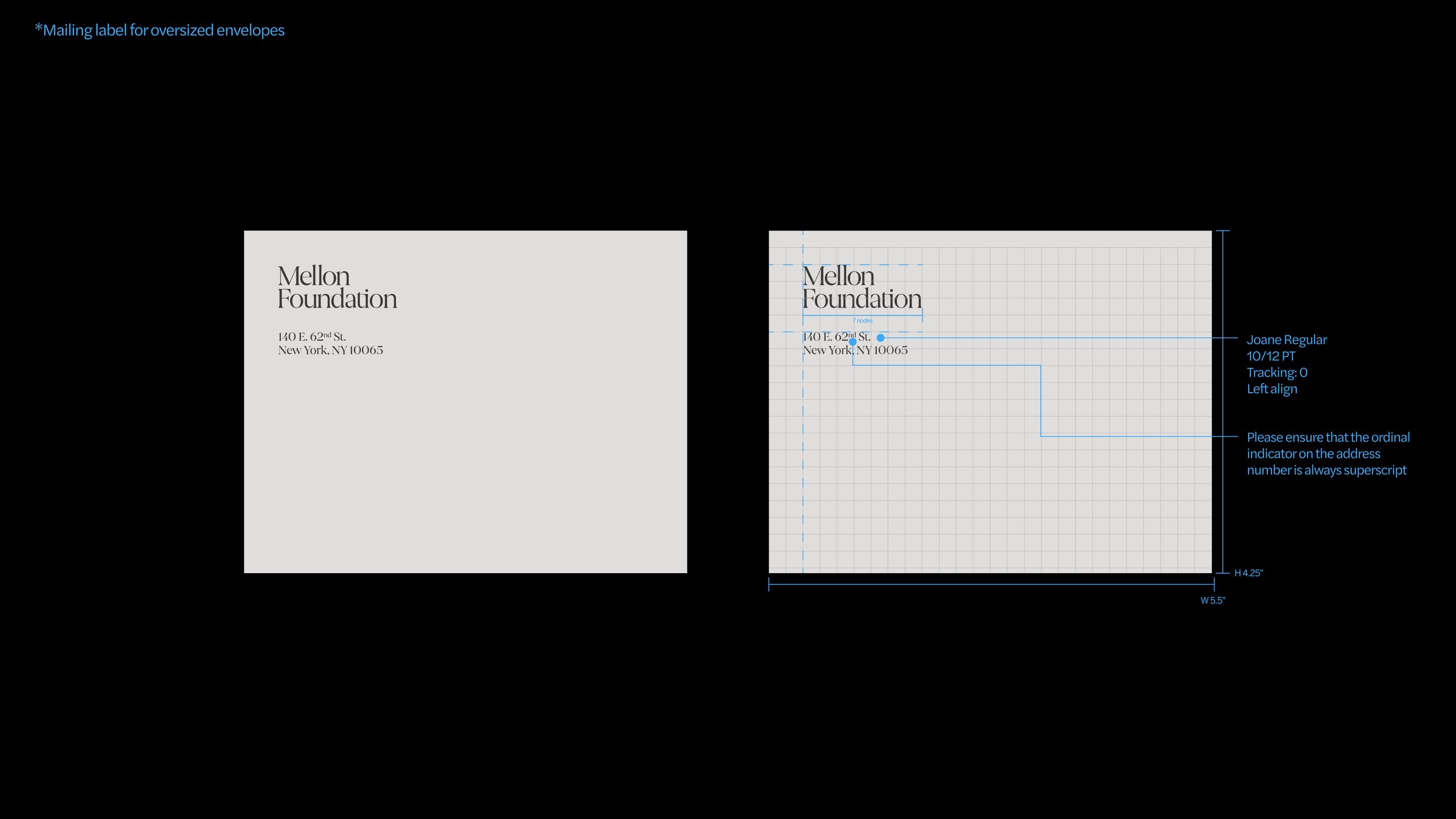
Stationery
Mellon’s stationery items should follow the Core Visual System. The M logomark should not be a graphical element, and placement of the M should be simple. Ensure that the M is small on formal documents such as letterheads and business cards and uses only the primary logomark. Use the node grid to create clear space and alignment as in the provided examples.
Below are examples of Mellon’s stationery suite; templates for these items are available for download here.
Print Letterhead 8.5 X 11 inches
DL Envelope
Business Card

Mailing Label*
Notepad*

Notepad

Thank You Card

Thank You Card–Envelope

Menu

Paper
Using the right paper can give a stationery set so much life. And that’s what we want for Mellon—stationery that feels special, pristine when you receive a letter, grant, or thank you from us.
There are a few things we consider when selecting paper:
Color

Color is one of the most obvious features of a paper. We can add a sense of warmth or cool, energy or calm, and even instill the brand color palette.
Texture

Texture is more subtle, but its presence can completely transform a paper. Some textures are more intense than others. Texture gives a sense of humanity or earth—you can literally feel something.
Weight
Weight must range for different paper uses. But using carefully considered weights in paper can make it feel more substantial or important in your hand.
Our paper options (marked in books):
