Color & Material
Openness is a central attribute of Mellon’s personality. The Foundation seeks to be equitable, accessible, and nurturing, while our grantees represent the multivocality of our communities. Our visual identity conveys those qualities through its color, materiality, texture, and form. Using a flexible logomark structure coupled with an adaptive color palette, our logomark expresses a multiplicity of ideas, memorably.
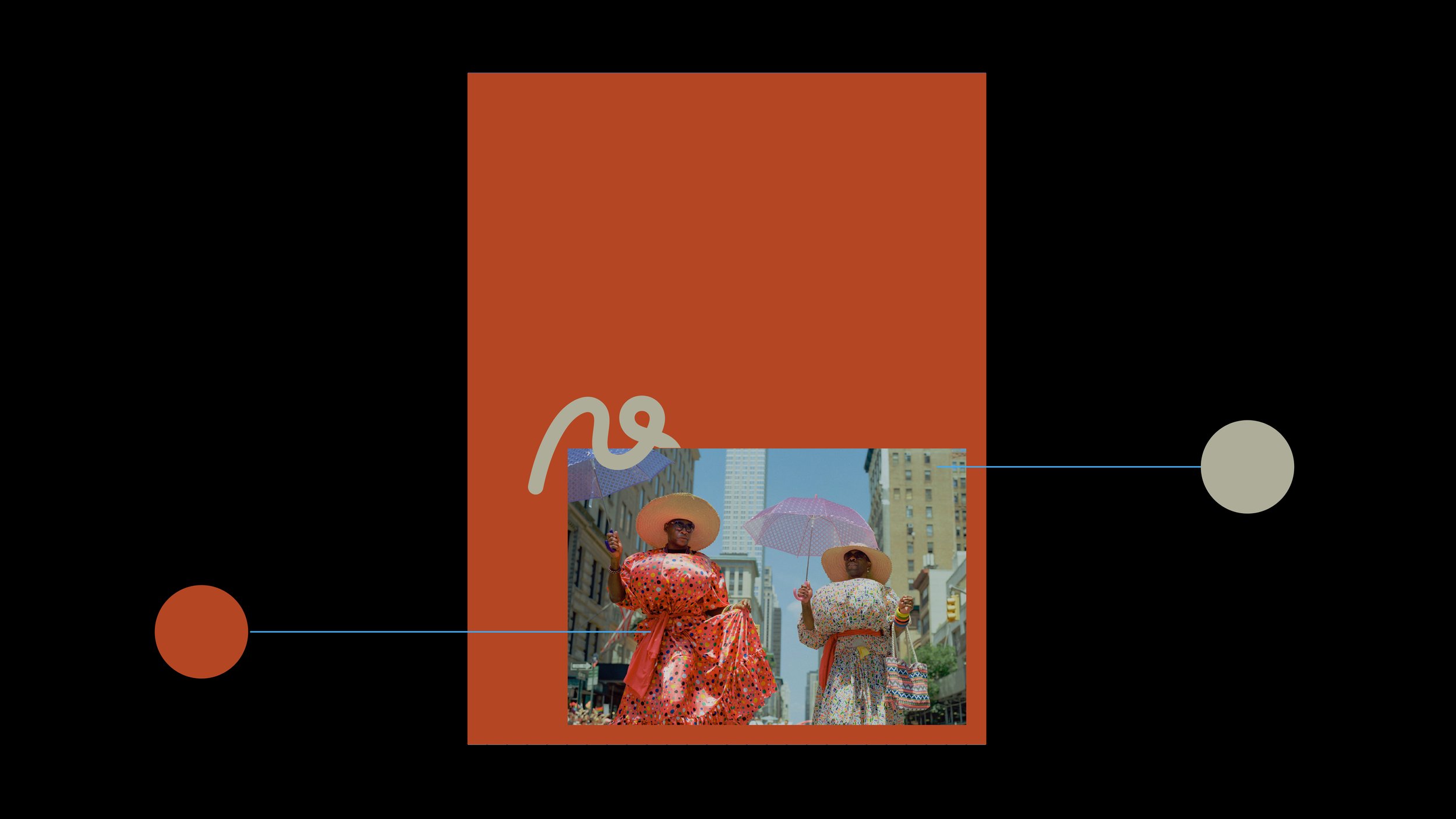
Adaptive Color Palette
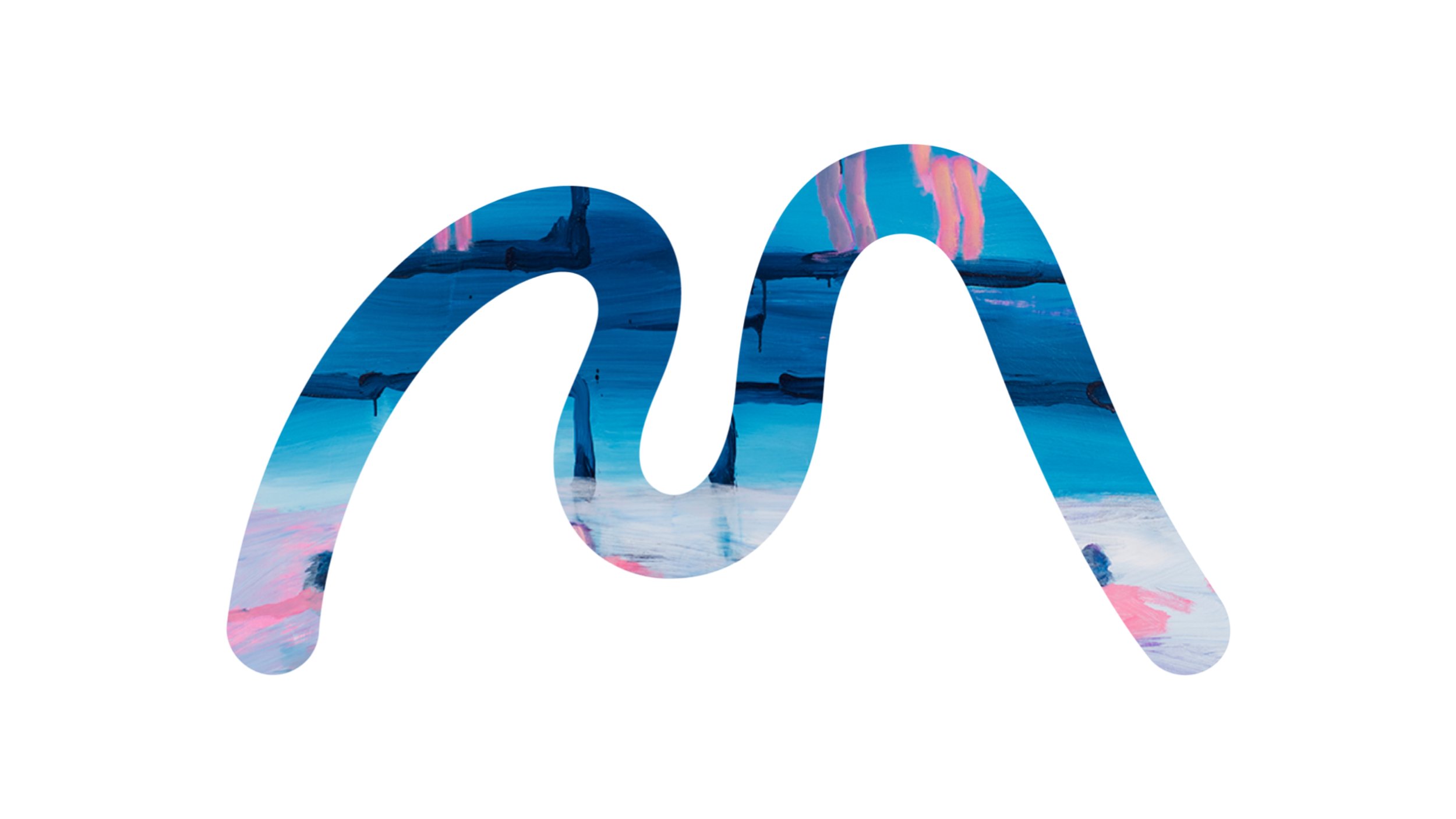
Mellon’s color palette adapts to and nurtures imagery and art. The work of our grantees drives and centers how we express ourselves through color, and generates complementary color extractions that are unique to each publication, website, post, or graphic.


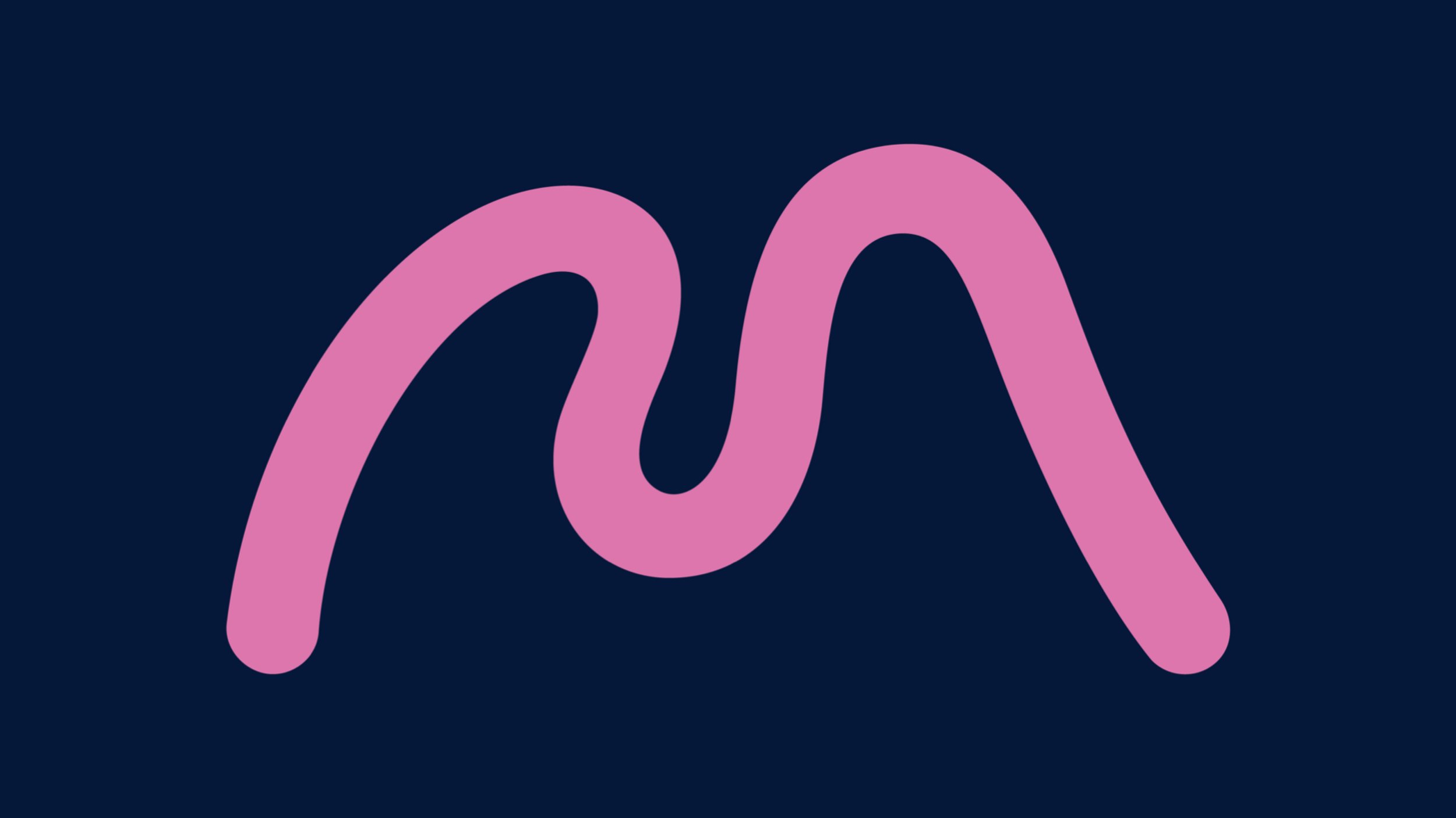
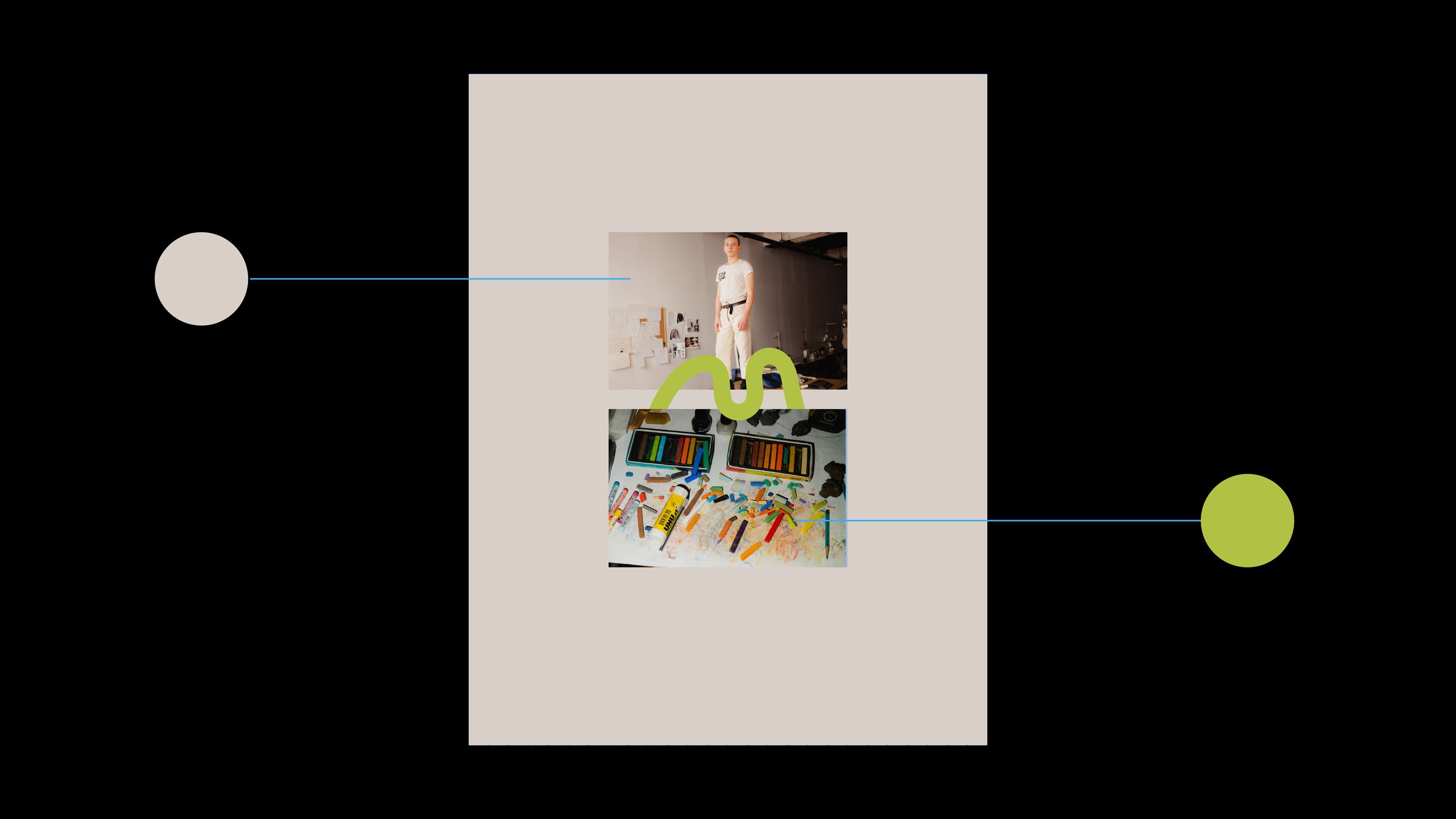

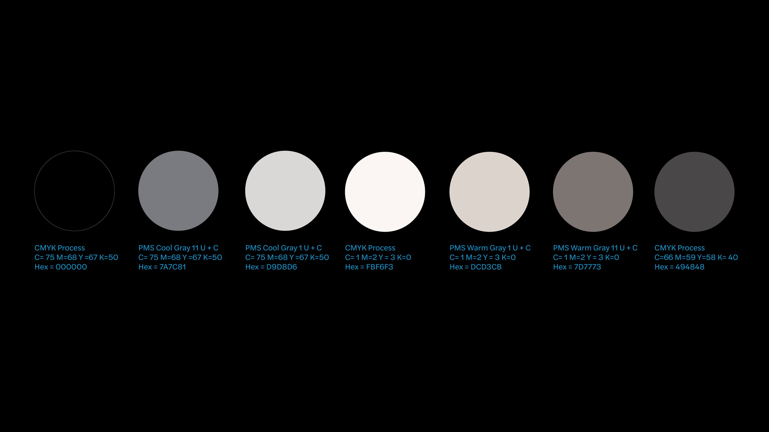
Neutral Palette
Mellon’s neutral palette is to be used for formal applications that follow the Core Visual System, such as stationery. This is to be used when an adaptive palette is not applicable.
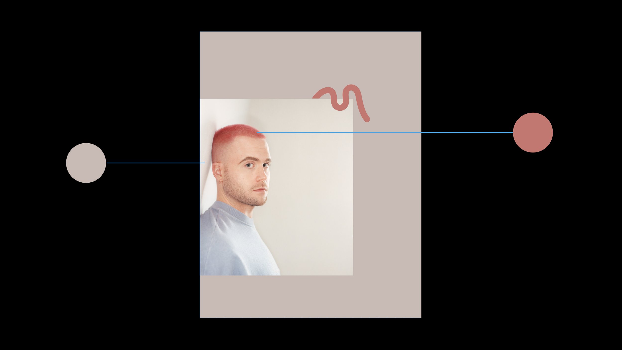
Our logomark embraces its physical environments, or when complementing an artist’s work in material such as ceramic or stone, it embodies that material.
Material