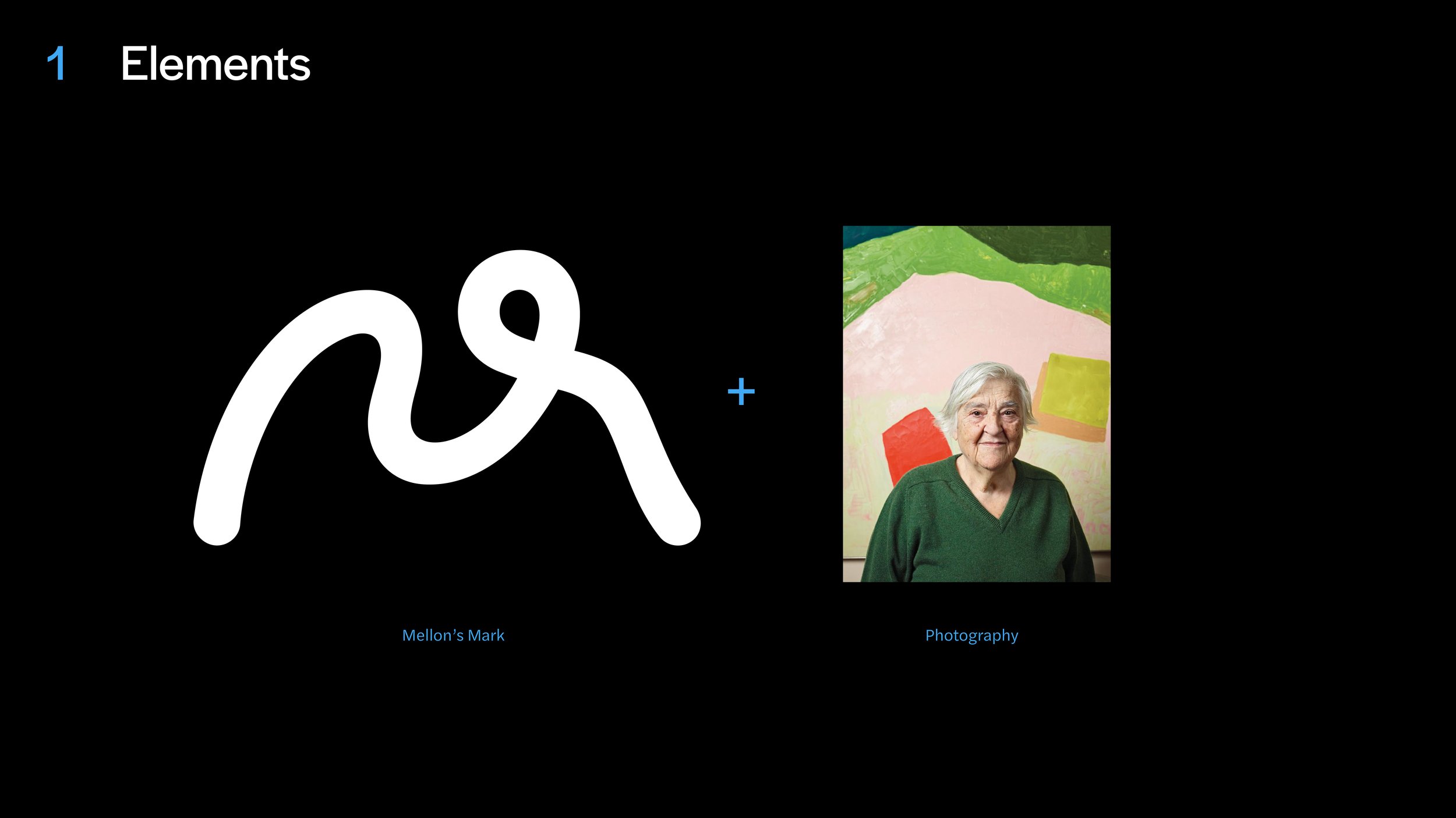
Visual System
Mellon’s visual system is broken down into five categories that range from minimal to expressive. It is important to follow the below guidelines to ensure that each system is being used effectively and appropriately.
Below is a breakdown of the visual system categories followed by examples of how and when to use each one.
Visual Range
-

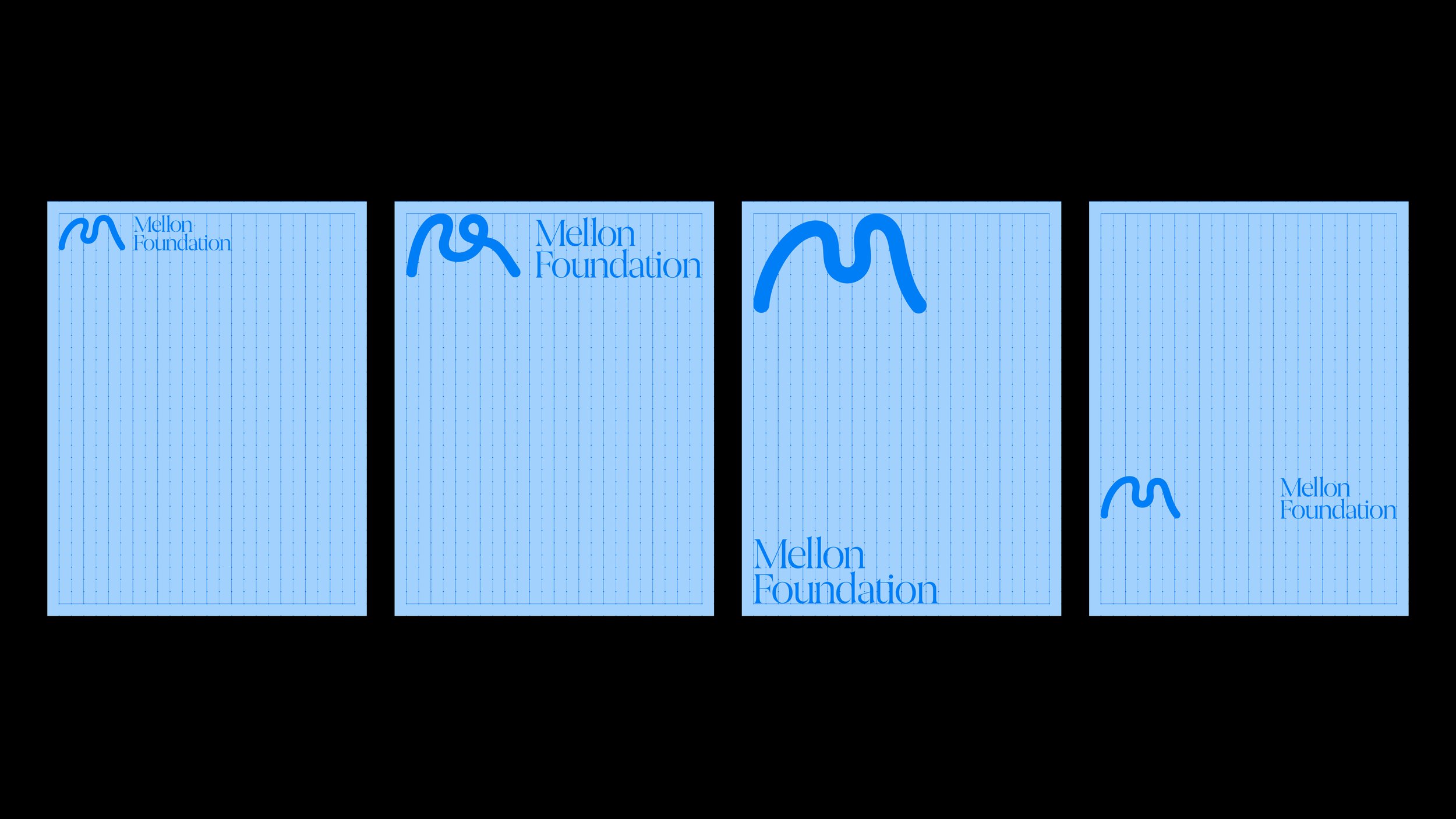
Core
Simple placement of the M, usually small, on formal documents or places where the M is not a graphic element.
-

Scaling
Using the logomark to scale and mask to create an immersive visual effect.
-

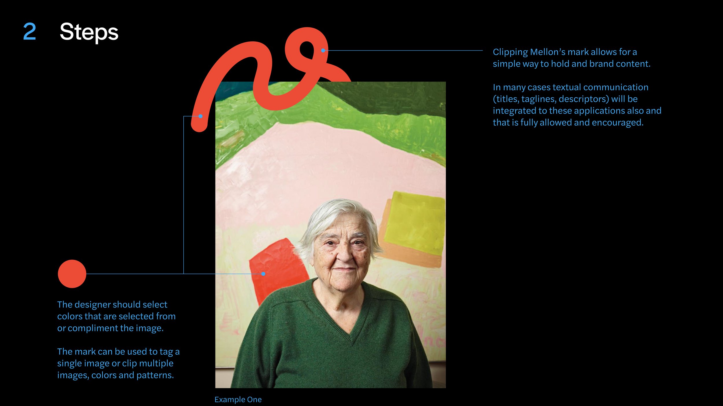
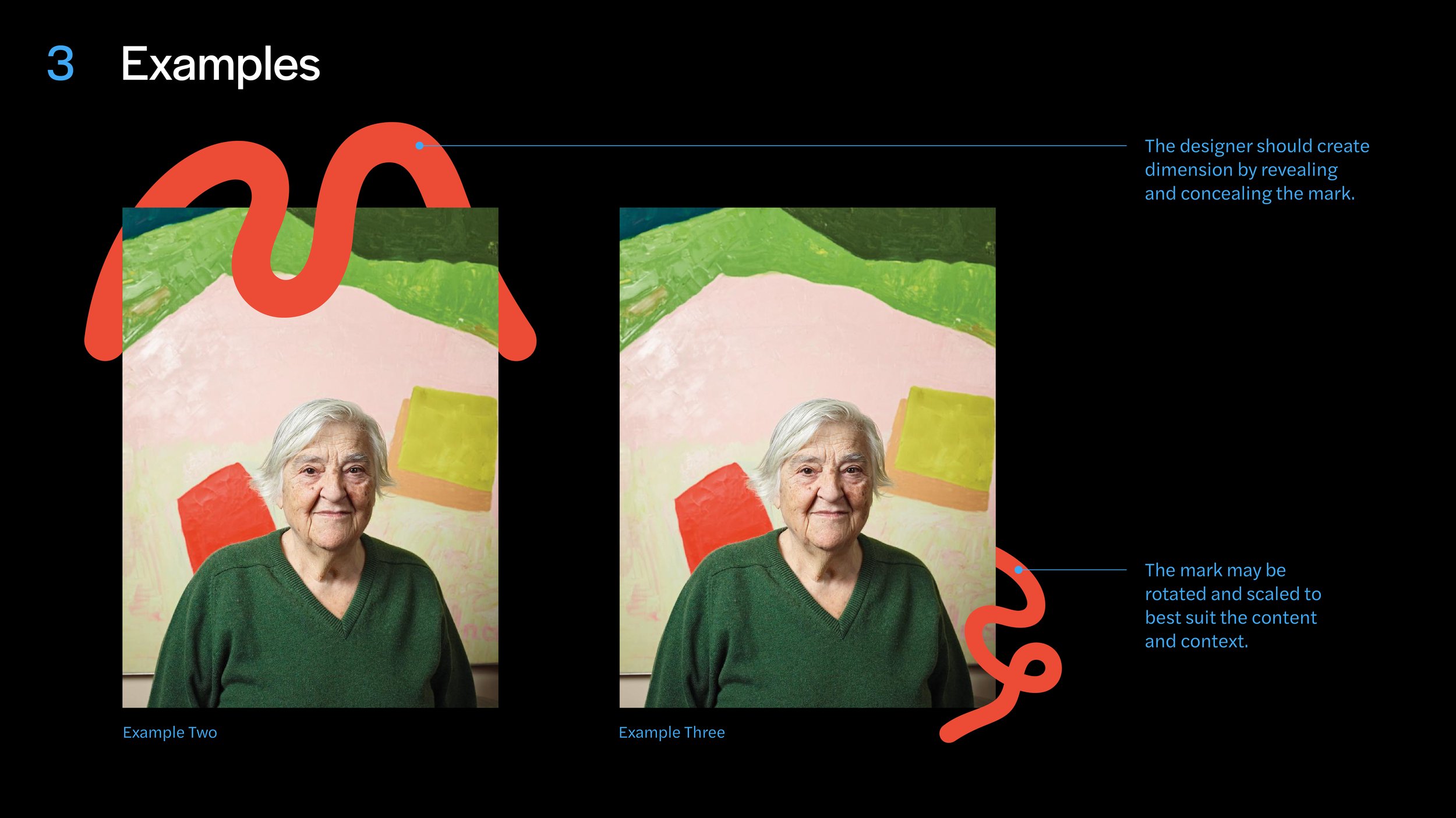
Layering
Graphic layering integrates our logomark directly with our content by allowing the logomark to create depth by wrapping around objects. It underscores Mellon’s connective qualities and demonstrates how Mellon is “intertwined” with the individuals, communities, and organizations with which we work.
-

Weaving
Established grids, placed images, and clear space work together to create a narrative around which the Mellon M can be woven throughout. By allowing the M to interact with images in this way, we underscore how Mellon elevates its grantees.
-

Experimental
In situations where a more experimental application of the logomark and visual identity is appropriate, use a more muted color palette for a sophisticated feel. Do not use the M as a standalone graphical element in this application—the M must always be interacting with and nurturing the other elements.
Working with Grids
By using nodes in our grid structure, we can easily make even grids and columns while also making guiding points for the logomark to sit on—with the outer margin being one unit.
The grid system is available by request for creative collaborators.

Visual System–Examples
Below are a number of examples of how to apply Mellon’s visual system to an image-based design such as a brochure cover.
Core
Our core approach allows us flexibility depending on the content demands and the intended audience.
Use this system for full-bleed imagery. The wordmark and logomark can be separated in this direction but should not interfere with the imagery. Ensure that the scale of the logomark is similar to that of the wordmark by using the node grid. Place the logomark in negative space and create contrast using the adaptive color system.
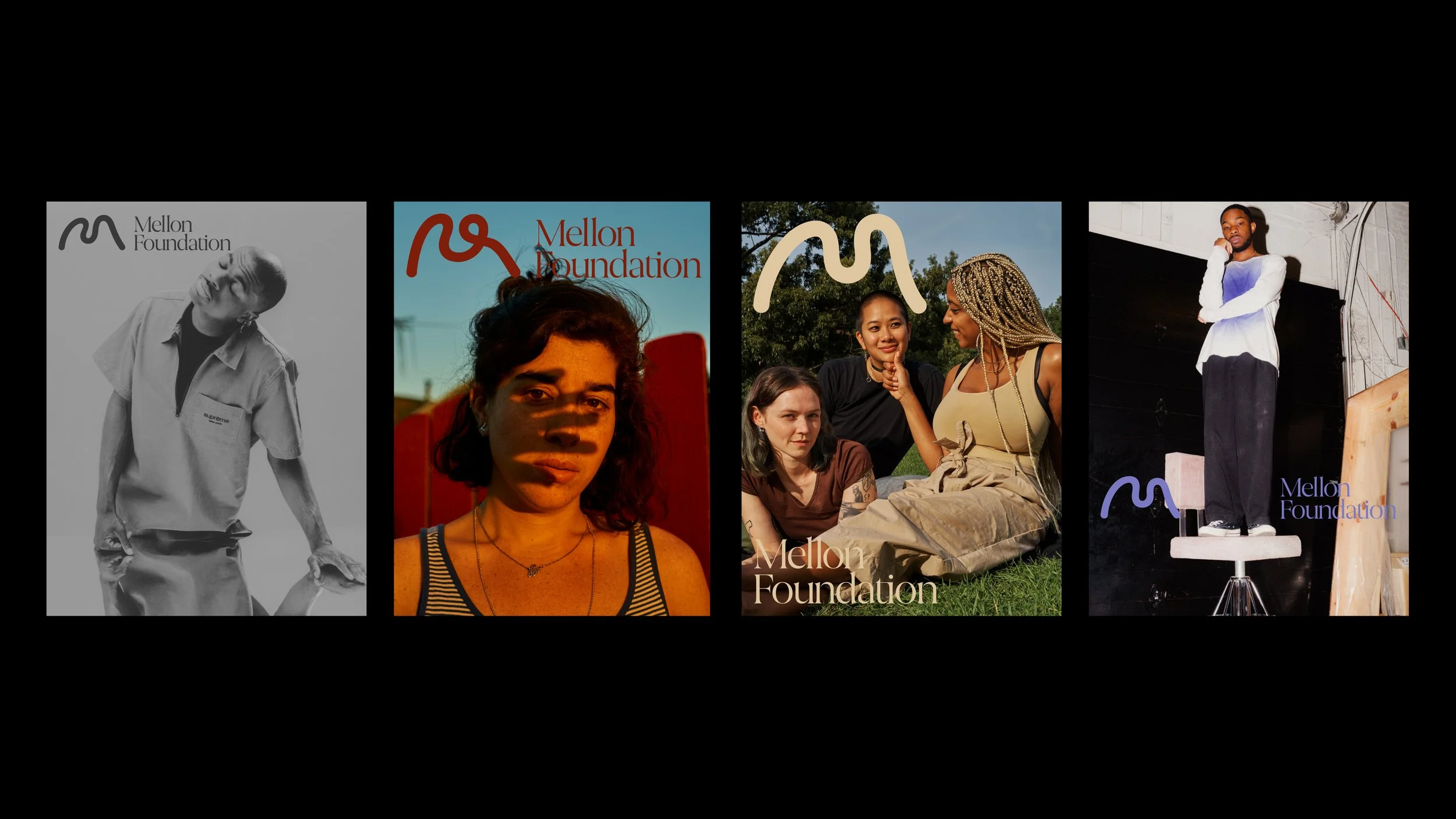
Scaling & Masking
Use scaling and masking to embrace a more graphic solution, showing story, process, and tools. Ensure that cropped M is not too disruptive of people or artwork. This approach is representative of Mellon providing people with the tools to grow and develop.


Layering
This direction integrates our mark with our content when appropriate and shows our connective presence.
Use the clipping of the Mellon M to show how Mellon is “intertwined” with the individuals and communities it works with, representing the caring quality of the Foundation. Guidelines for using the graphic clip are below.


Weaving
Our logomark goes beyond the expected and intertwines itself among our words and imagery.
Use these grid structures with multiple images and clear space to create a narrative. For example, show a portrait of an artist, their tools, and where they work, or show how Mellon elevates its grantees.


Experimental
This direction is for special scenarios where we can activate a more experimental side of Mellon’s brand.
Try to ensure that the M is not too disruptive when showing people or work, and use a more muted color palette so the images don’t feel too noisy. Don’t use the M as a standalone graphical element; make sure it’s always nurturing.


Poetic Type
Use both the text and image to determine how text will be set in these typographic layouts and adjust on the node grid. Use different weights and sizes of Joane or Halyard Display to emphasize certain words or phrases.
In this direction, use either Joane or Halyard; do not mix the two typefaces. Masking typography behind objects or people creates depth and communicates Mellon’s commitment to elevating its grantees.


Juxtapose
Use the node grid to divide the page into sections and create juxtapositions in the composition. This can be between light and dark, or positive and negative space. If you are working with only one image, scale and crop into the image.
Consider these juxtapositions when setting typography. Place type in negative space to create balance and a relationship between type and image in the composition.


Activating the Graphic Clip
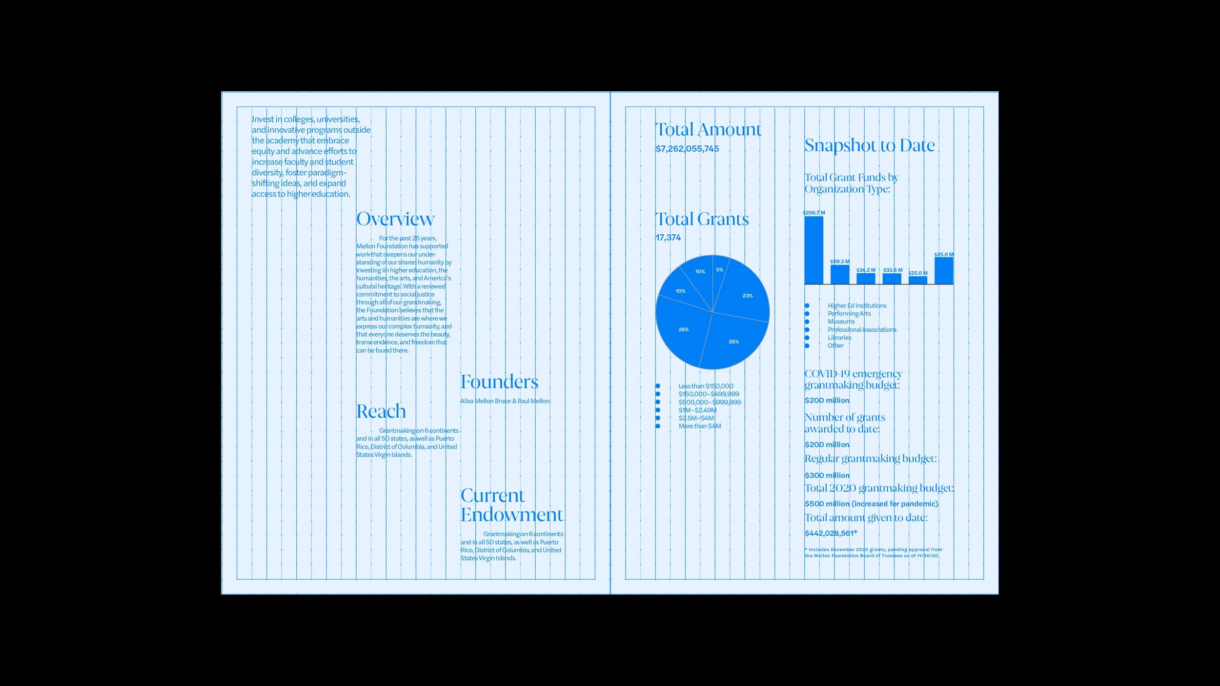
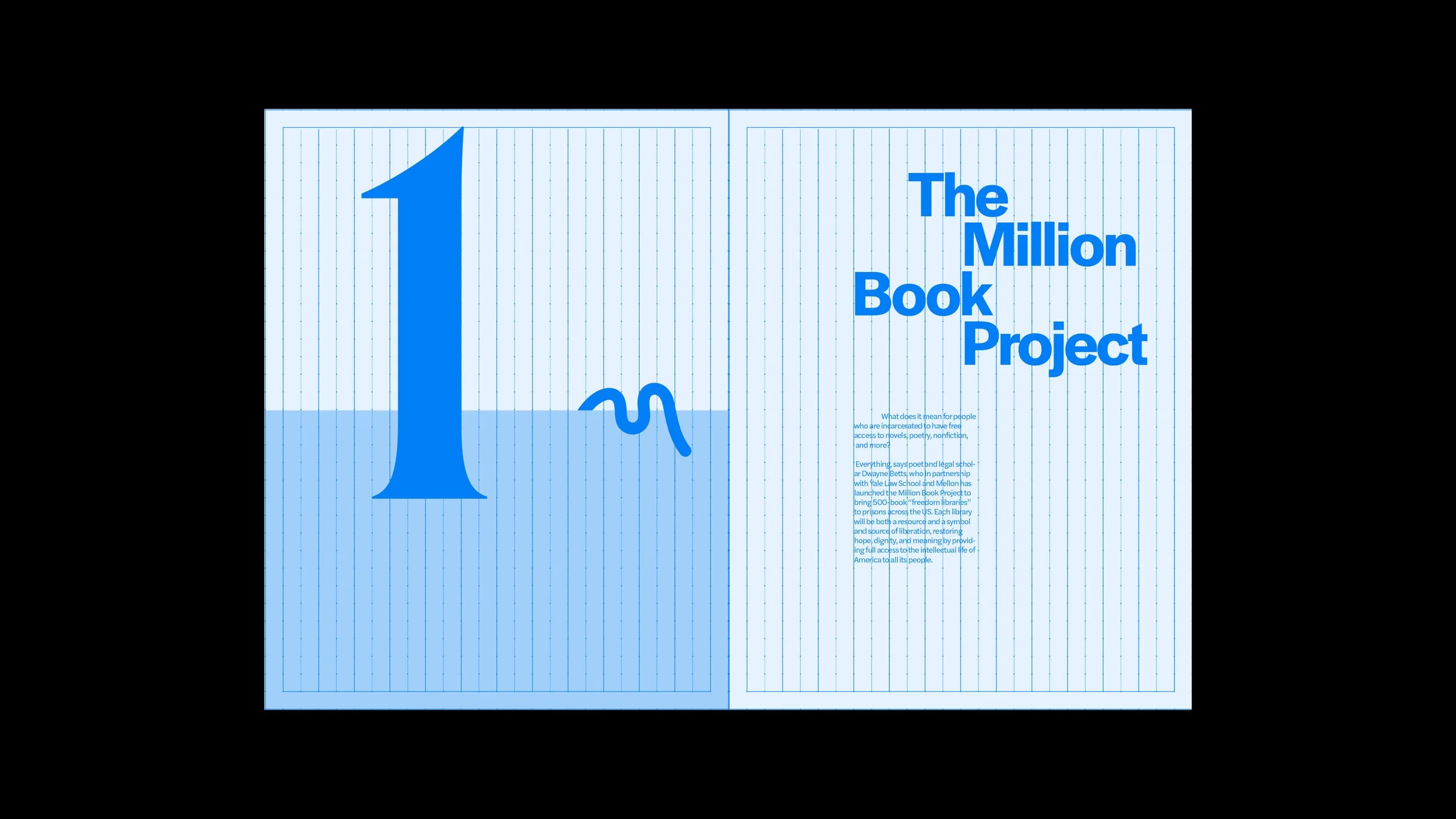
Typography System–Brochure
Below is an example of how Mellon’s typographic system should be applied to a design. This example is an existing Mellon brochure and displays how type should be applied to the grid system in covers, text pages, infographics, and spreads.