Defining the Personality
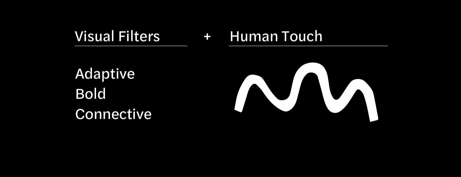
Our visual identity is adaptive and flexible, infused with a human touch.
This visual shift distinguishes our brand. It visualizes our presence and understanding of our surroundings when and where appropriate.
Defining the Personality
Our visual identity is adaptive and flexible, infused with a human touch.
This visual shift distinguishes our brand. It visualizes our presence and understanding of our surroundings when and where appropriate.
Visual Translation
Mellon’s visual identity is the set of visual markers that both allows us to express and reinforce our values through aesthetics.
These visual markers encourage memorability, reinforce distinctiveness, and underscore authenticity. Our visual identity gives shape to our values.
A Fluid Identity
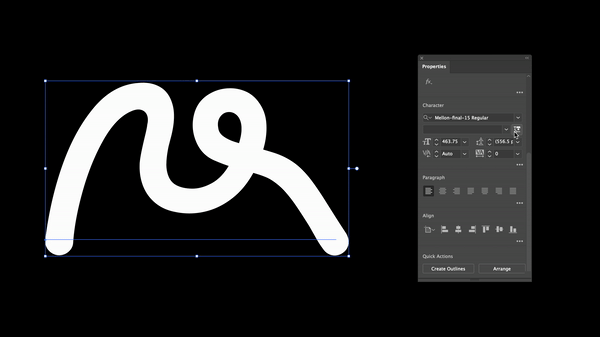
Mellon’s identity’s can we be customized at anytime via key parameters by creatives at Mellon.
Our mark needs a seamless underlying structure to achieve purpose and longevity.
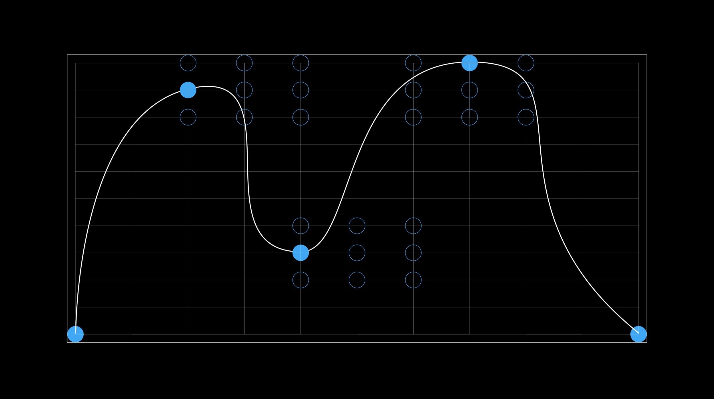
A cluster of nodes surrounding key paths on our mark can guide where and how it shifts.
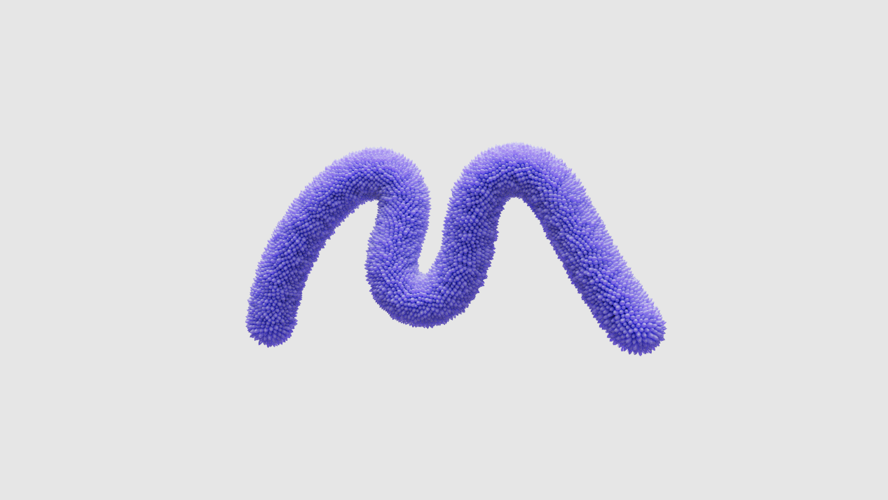
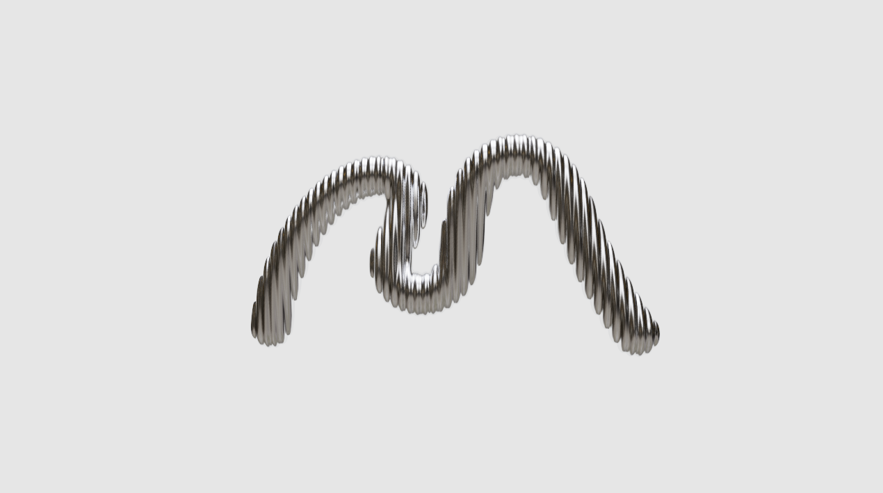
Range of Expression
-

Pristine
The Pristine M is our primary M mark, and it appears on core Mellon material including stationery, the main website logo, social media avatars, etc. Additionally it can be used anywhere, and works alongside any type of imagery or content.
-

Empowering
An Empowering M stands tall. This M appears when the related imagery or words are to do with social justice or works to do with serious topics. The associations should be to do with either change, or making work that shares ones experience in the hope of spreading awareness.
-

Dynamic
A Dynamic M loops and intersects with itself and the elements around it. It appears when the associated imagery or words are associated with movement (such as literal dance) happiness, positive community experiences, and more.
-

Reverential
A Reverential M lowers and lengthens itself. It appears when the associated content is reflective, solemn, or mournful. This can oftentimes be associated with memorials or works to do with lost lives or dark experiences. It can also appear associated with spaces that are quiet or reflective, even if they aren’t necessarily sad.
Logomark Clearspace
This example demonstrates the Logomark scaled to match the height of the Logomark to define the minimum safety area. This area must not be imposed upon by other graphics.
Wordmark Clearspace
This example demonstrates the extracted M from the Wordmark to define the minimum safety area. This area must not be imposed upon by other graphics.
Logomark and Wordmark Clearspace
This example demonstrates the Logomark scaled to match the height of the Logomark to define the minimum safety area. This area must not be imposed upon by other graphics.
Primary Lock-Up
Mellon’s Logomark is bold yet pristine—paired with typography that speaks and holds the presence of poetry.

Secondary Lock-Up
For the secondary lock-up, and in in-formal contexts, the mark may be replaced with one of the variants.

Formal Usage Lock-Up
In formal contexts, the full title may be used.

Intertwined Lock-Up
Lorem ipsum dolor sit amet, consectetur adipiscing elit, sed do eiusmod tempor incididunt ut labore et dolore magna aliqua. Ut enim ad minim veniam, quis nostrud exercitation ullamco laboris nisi ut aliquip ex ea commodo consequat.


Animated Marks
Lorem ipsum dolor sit amet, consectetur adipiscing elit, sed do eiusmod tempor incididunt ut labore et dolore magna aliqua. Ut enim ad minim veniam, quis nostrud exercitation ullamco laboris nisi ut aliquip ex ea commodo consequat.
Materials and Color
Our mark will embrace its physical environments, or when complimenting an artists work in material—such as ceramic or stone, it will embody that material.


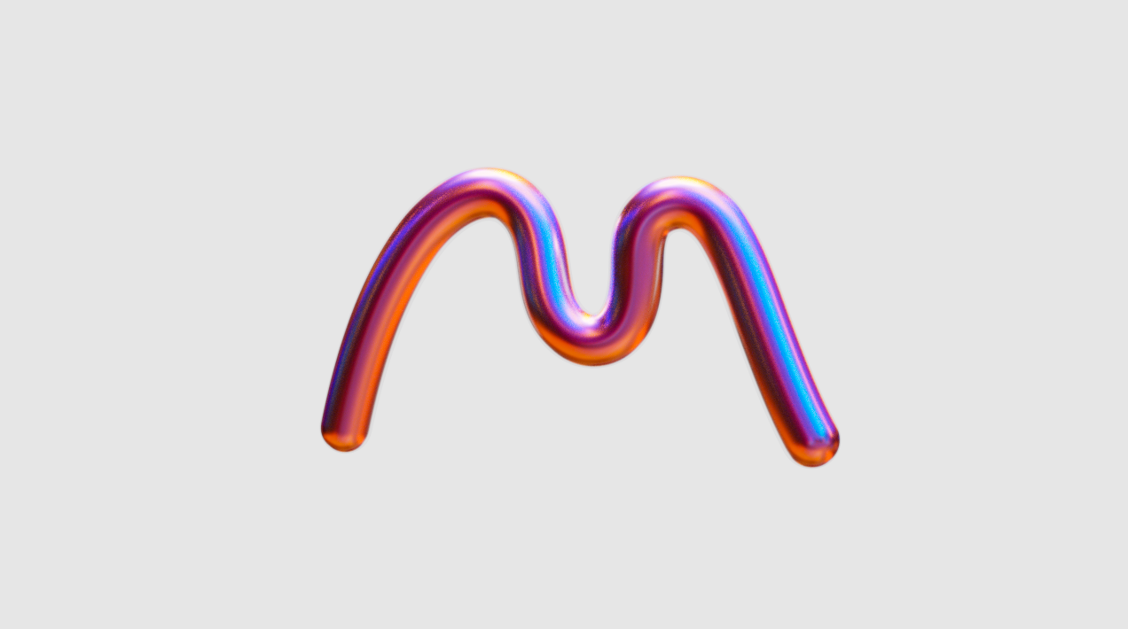


Mellon’s color pallet adapts to and nurtures imagery and art.
An adaptive color system can create complimentary color extractions from imagery and art work, this approach stems from the visual filters for Mellon’s new brand.
Color


How our words are situated is important. By properly typesetting our typefaces, we maximize legibility and emphasize content hierarchy.
Typography

A Perfect Pairing
-

Our Serif
Joane is a beautifully drawn serif that mixes the elegancy of French didones, calligraphic endings and glyphic serifs. Its features convey warm and distinct style, it was drawn in a Chilean type foundry called W Type Foundry.
Joane is used in our logotype and as our display typeface (aka, used at large sizes for headlines only).
-

Our Sans
Halyard’s personality is at once familiar and pleasingly distinctive. Halyard’s familiarity results from select elements of classic designs of the 19th and early 20th centuries by Schelter+Giesecke, Miller and Richard, and Morris Fuller Benton. It was drawn in the US by Darden Studios.
The following pages will show two options for our sans serif typeface. This font (in contrast to Joane) will be our workhorse for content use cases large to micro.
Character Sets
Lorem ipsum dolor sit amet, consectetur adipiscing elit, sed do eiusmod tempor incididunt ut labore et dolore magna aliqua. Ut enim ad minim veniam.


Joane Weights
Lorem ipsum dolor sit amet, consectetur adipiscing elit, sed do eiusmod tempor incididunt ut labore et dolore magna aliqua. Ut enim ad minim veniam.

Halyard Weights
Lorem ipsum dolor sit amet, consectetur adipiscing elit, sed do eiusmod tempor incididunt ut labore et dolore magna aliqua. Ut enim ad minim veniam.

Typesetting
When typesetting both Joane and Halyard, avoid hyphens and try to keep the line-lengths relatively even. The tracking should always be set to 0.
Joane

Halyard

This DNA is inspired Florence Price’s Symphony No.1 in E Minor.
Price often took inspiration from folk melodies and church songs, creating music with roots in tradition and community.
Price’s Symphony is particularly notable, as it was the first composition by an American woman of color to be performed by a major orchestra.
Sonic Design


Visual Range
-

Core
Simple placement of the M, usually small on formal documents or places where the M is not a graphic element.
-

Scaling
Using the mark to scale and mask to create an immersive visual effect.
-

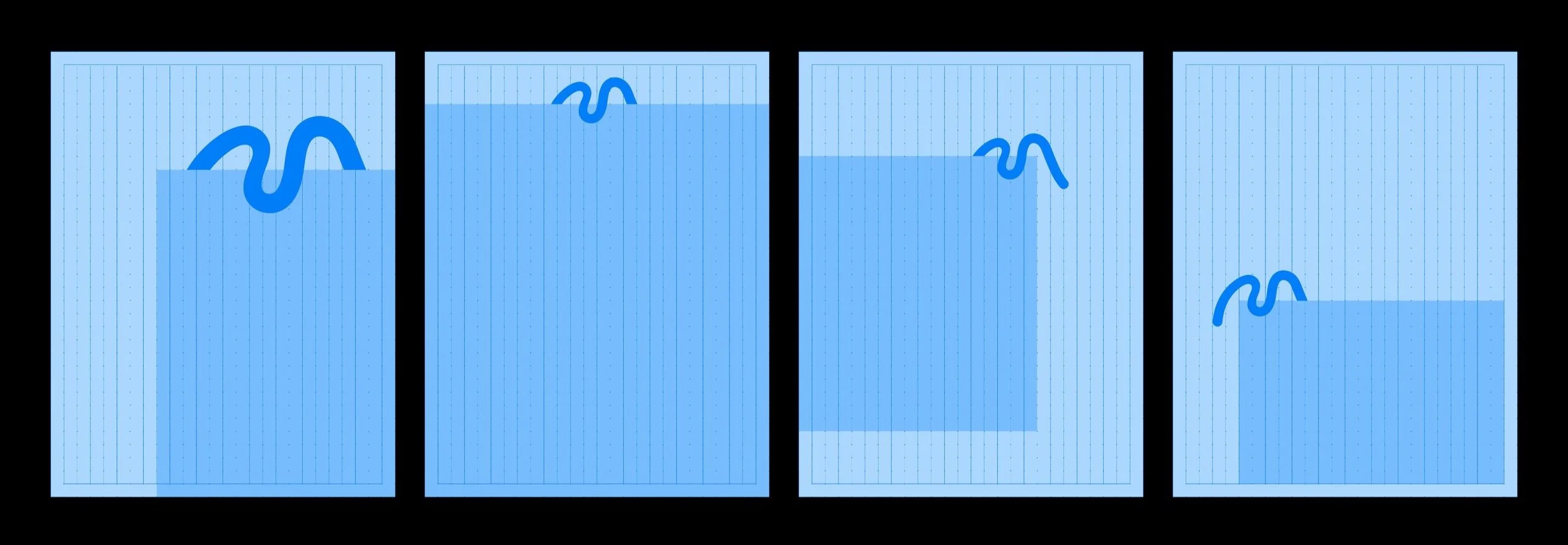
Layering
Using the mark to grab onto Mellon assets to create a holding effect.
-

Weaving
Using the M to weave in and out of type, layers, or imagery to create a dimensional effect.
-

Experimental
Giving Mellon designers freedom to create new and interesting graphics when appropriate.
Working with Grids
By using nodes in our grid structure we can easily make even grids and columns while also making guiding points for the logomark to sit on—with the outer margin being 1 unit.
Below are some examples of how these directions can be executed.